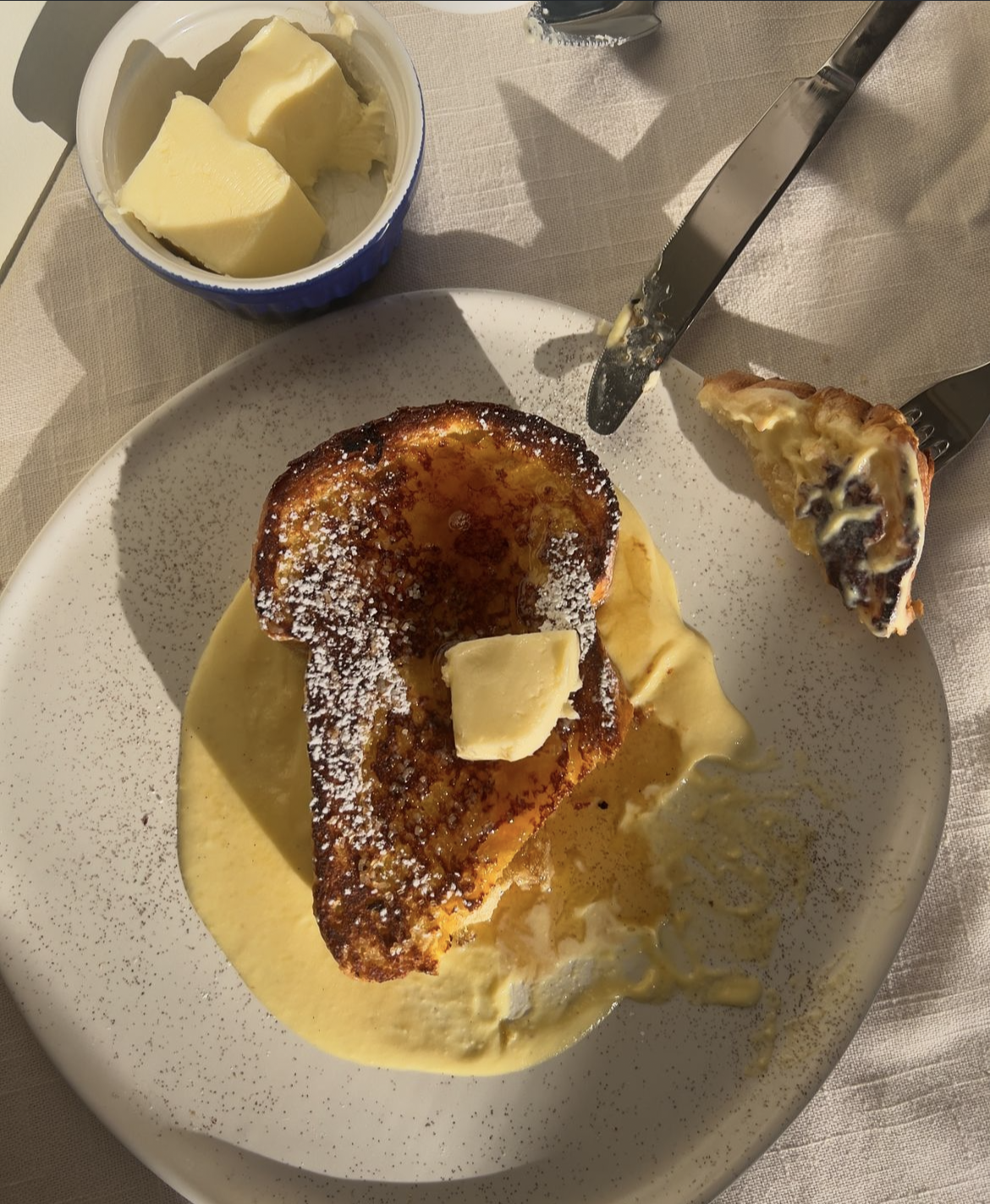
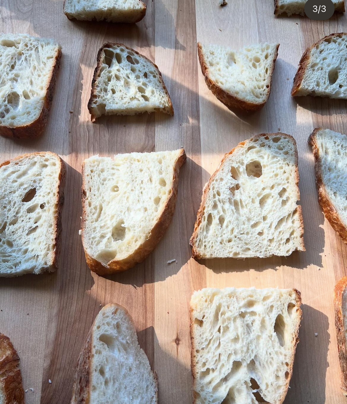
A brand built to bring real sourdough—nutritious, flavorful, and authentic—back to the table.
Challenge
Co-Dough had no visual identity—just great sourdough baked out of her kitchen. Without a consistent brand, it was difficult to present her bread in a professional, recognizable way.
Process
I worked with the founder to define the look and feel of her brand: simple, approachable, and rooted in tradition. Together we explored type, color, and tone to capture the heart of Co-Dough.
Solution
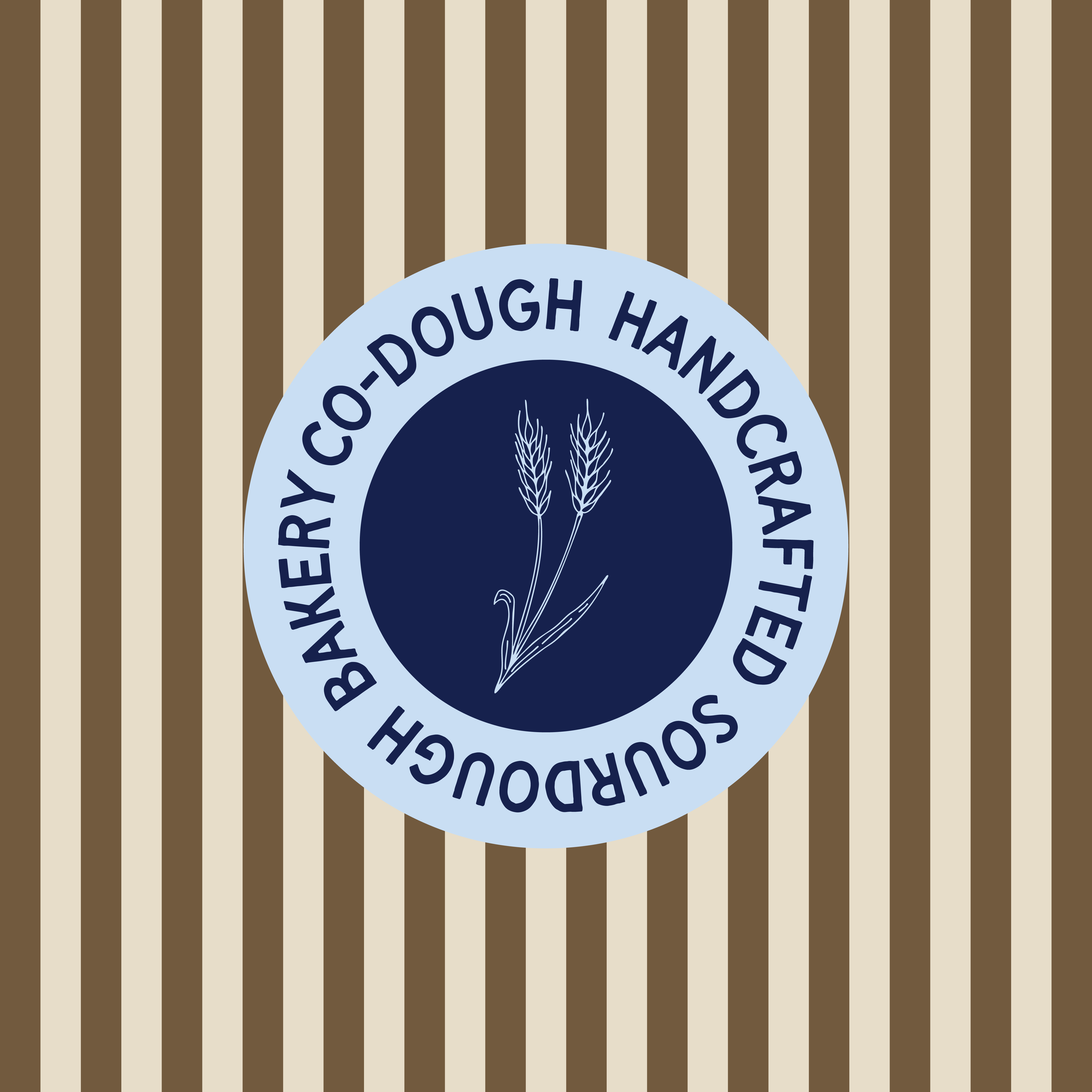
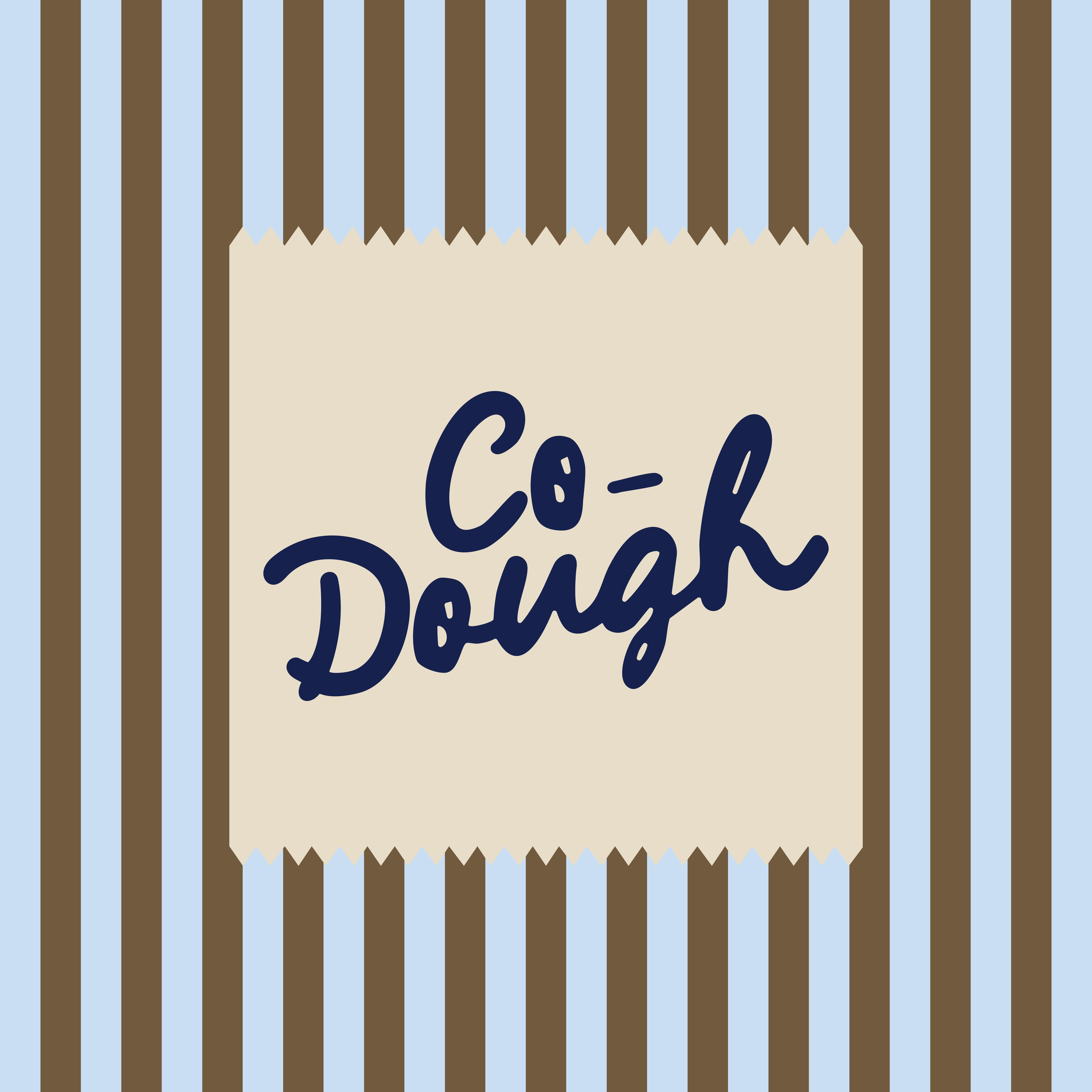
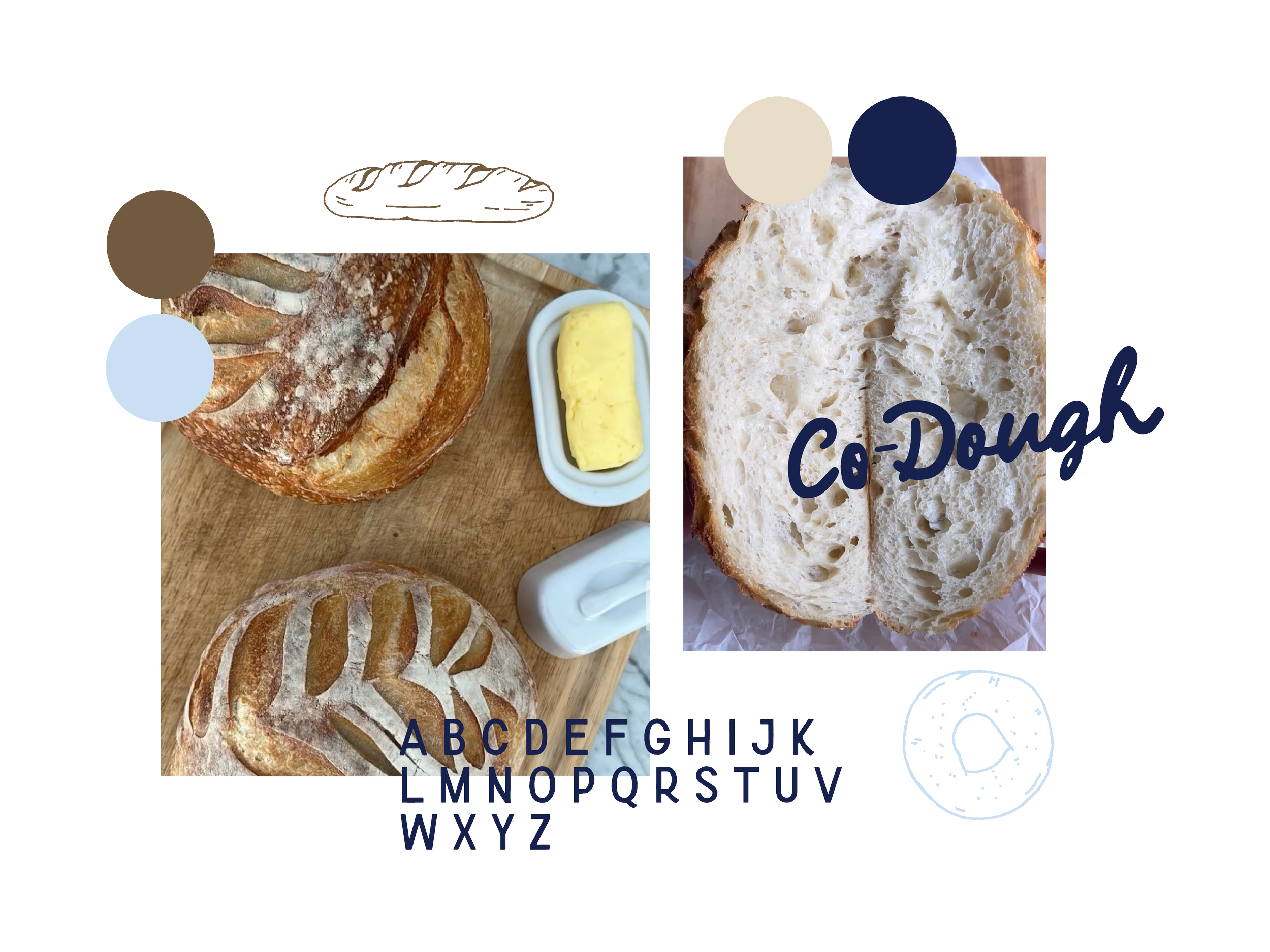
I built a mini brand kit with logo variations, typography, and a warm color palette. This gave Co-Dough the flexibility to apply her identity across labels, social posts, and other small-scale needs.
Outcome
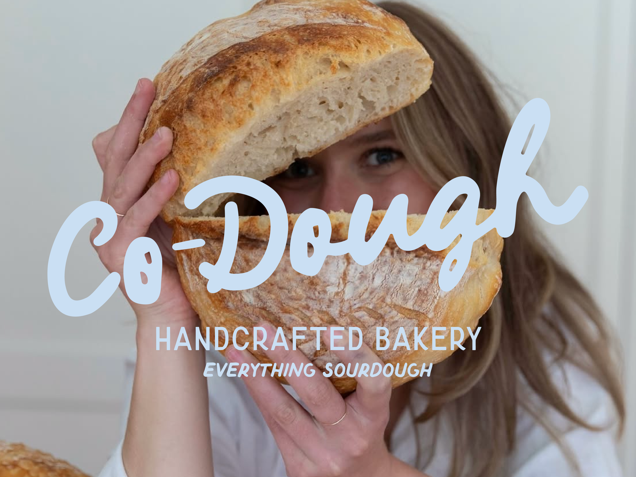
The brand system gave Co-Dough a professional yet approachable presence—something she could carry into farmers’ markets, Instagram posts, or wherever her baking journey leads next.