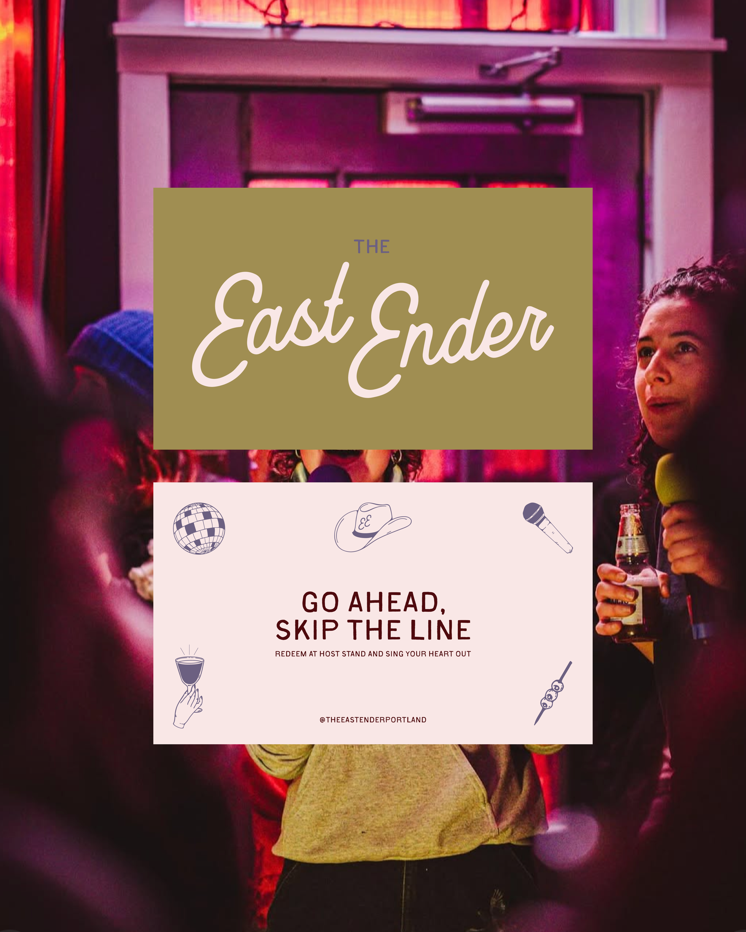
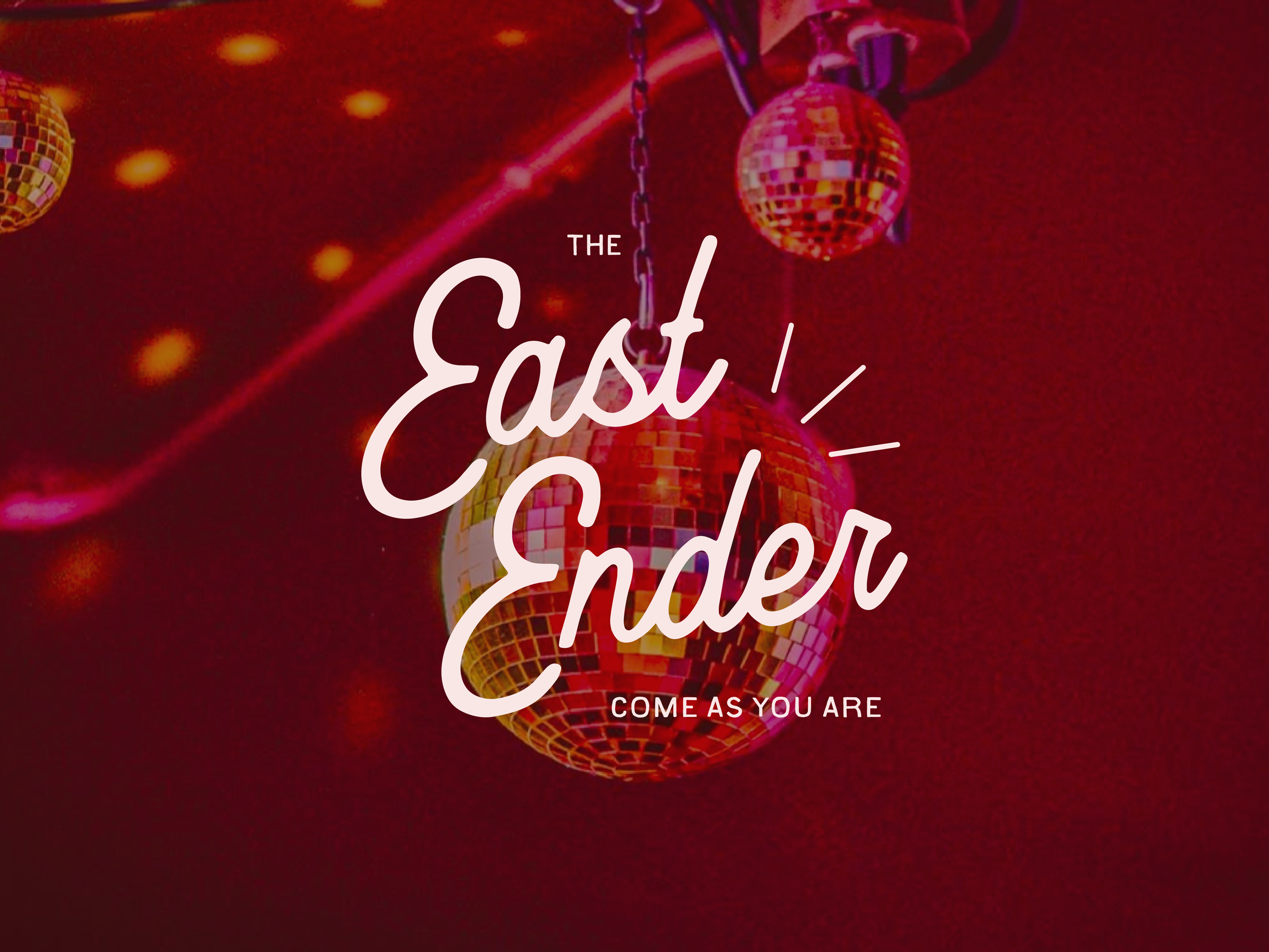
A visual identity that captures East Ender’s charm—warm, welcoming, and a touch chaotic.
Challenge
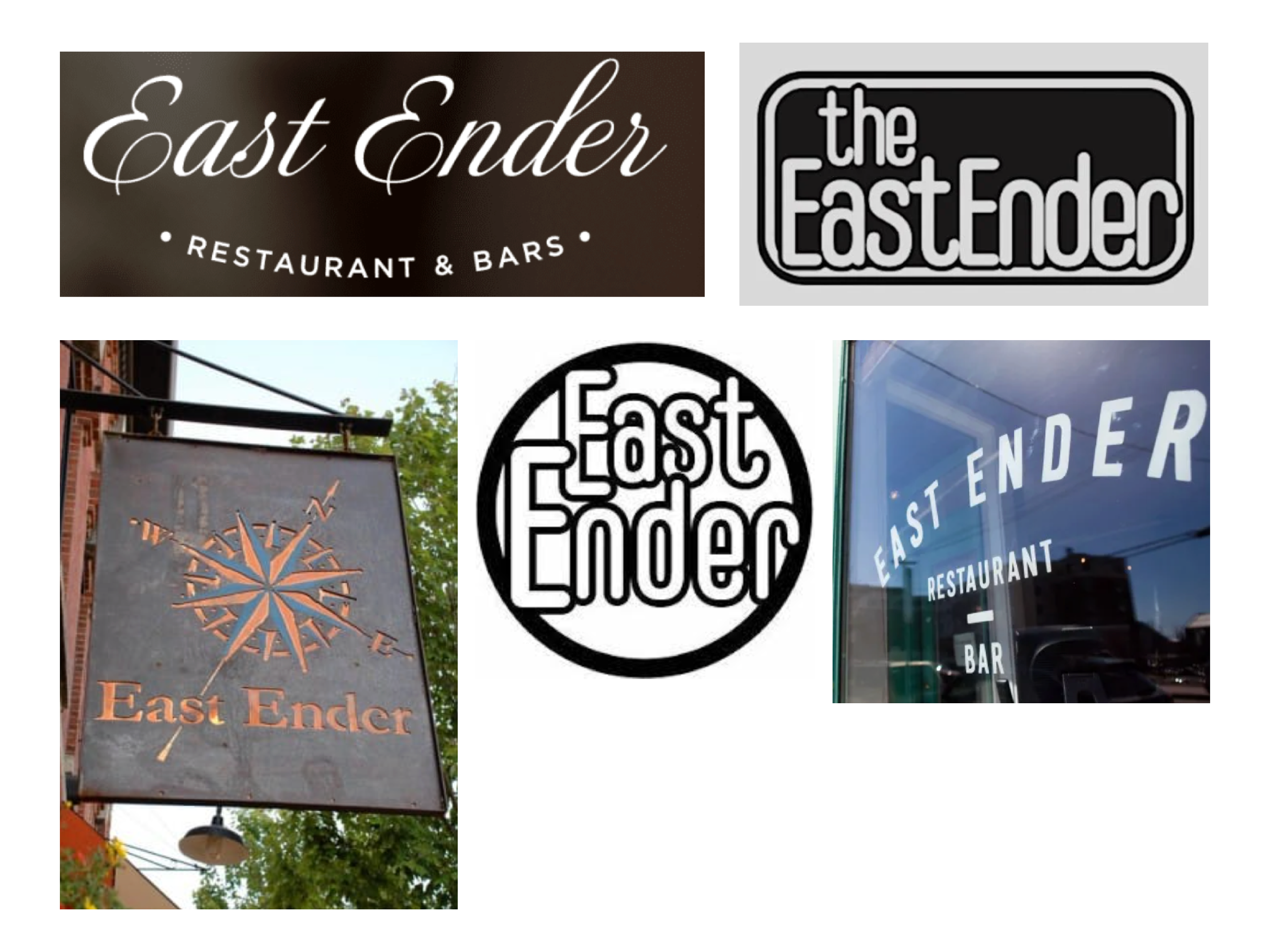
East Ender is a beloved neighborhood bar and restaurant, but their branding wasn’t keeping up. With multiple logos and no defined system, the identity lacked cohesion and didn’t fully capture the energy of the space.
Process
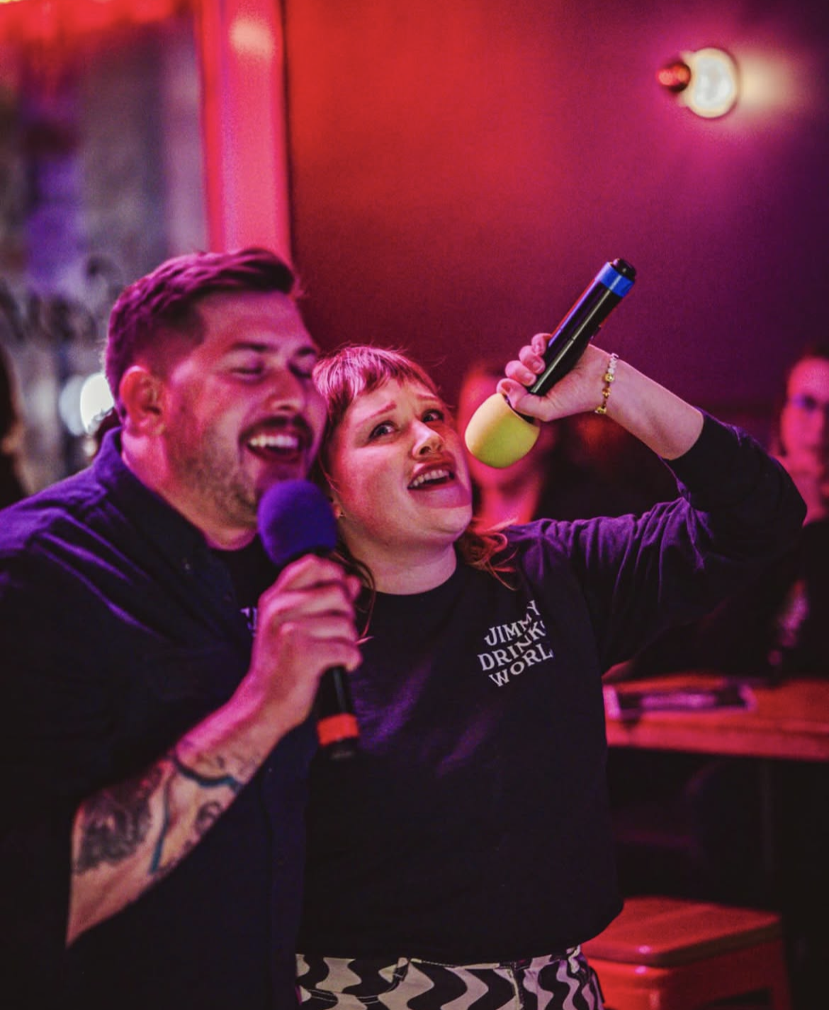
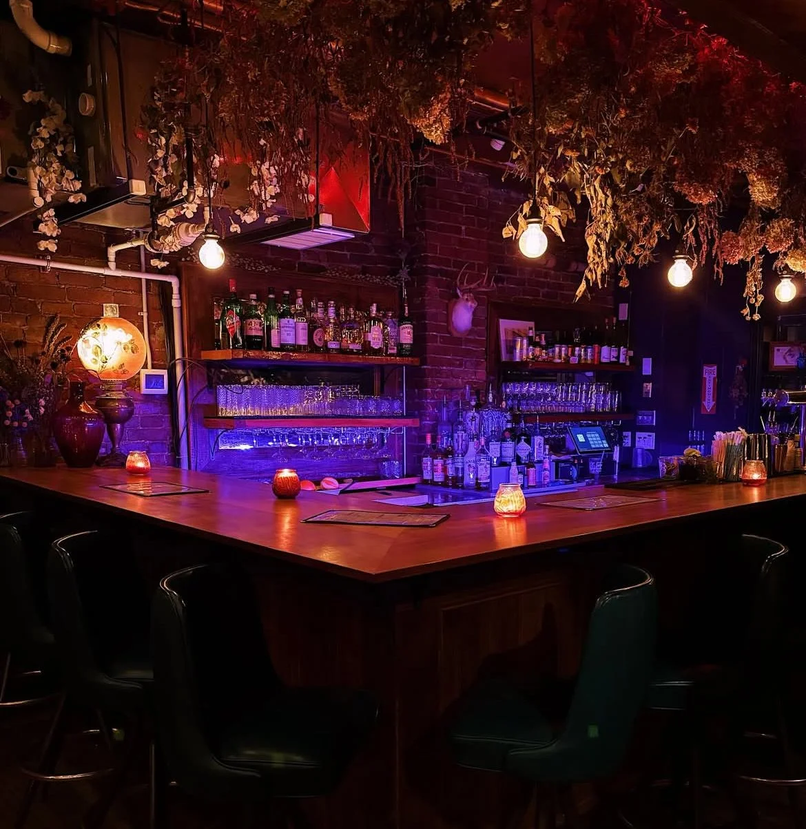
To understand what makes East Ender special, I immersed myself: karaoke nights, in-person chats with the owner, and plenty of time spent in the space. What I discovered was a feeling guests associated with; joy, connection, comfort, and a touch of chaos.
Solution
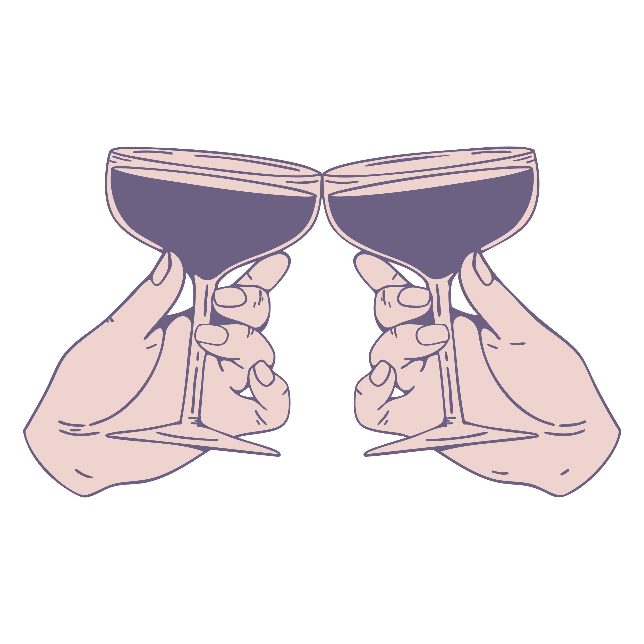
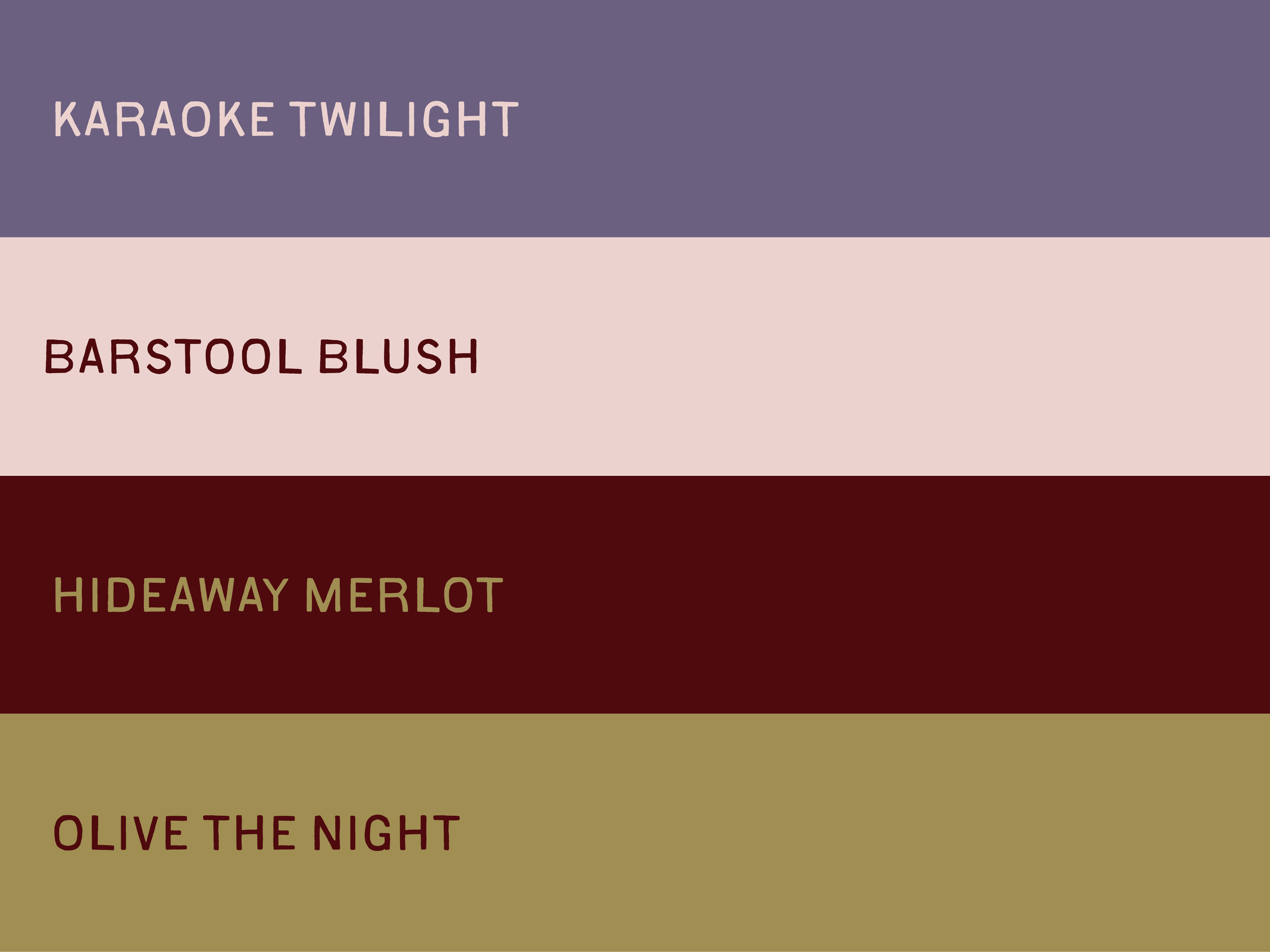
I created a visual system that brought clarity without losing character. The new logo suite preserved the lived-in charm of the originals while giving the restaurant a clear, recognizable signature.
Outcome
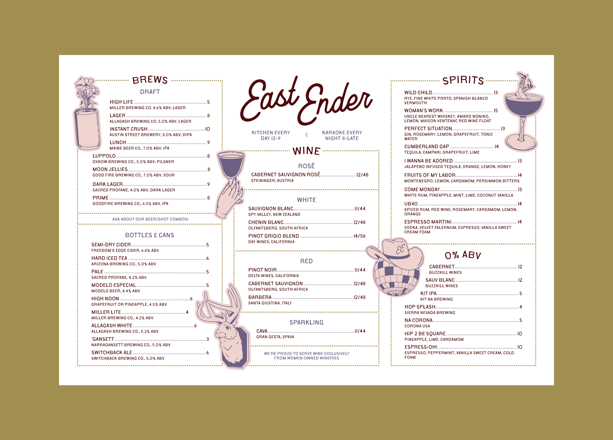
The new identity rolled out across website, merch, menus, and signage; designed to capture how East Ender feels, not just how it looks.