George + Leon's is a local Maine restaurant. I gave their food + spirits menus a facelift.
Challenge
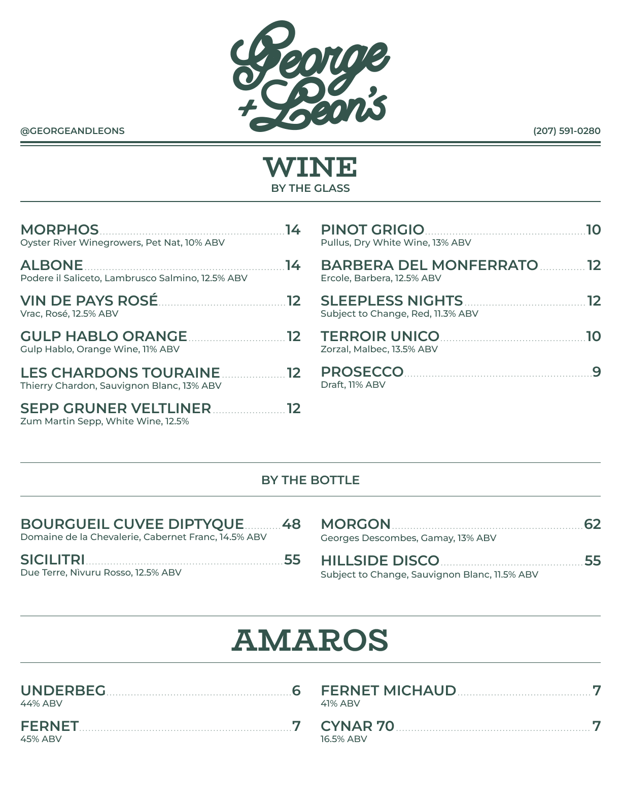
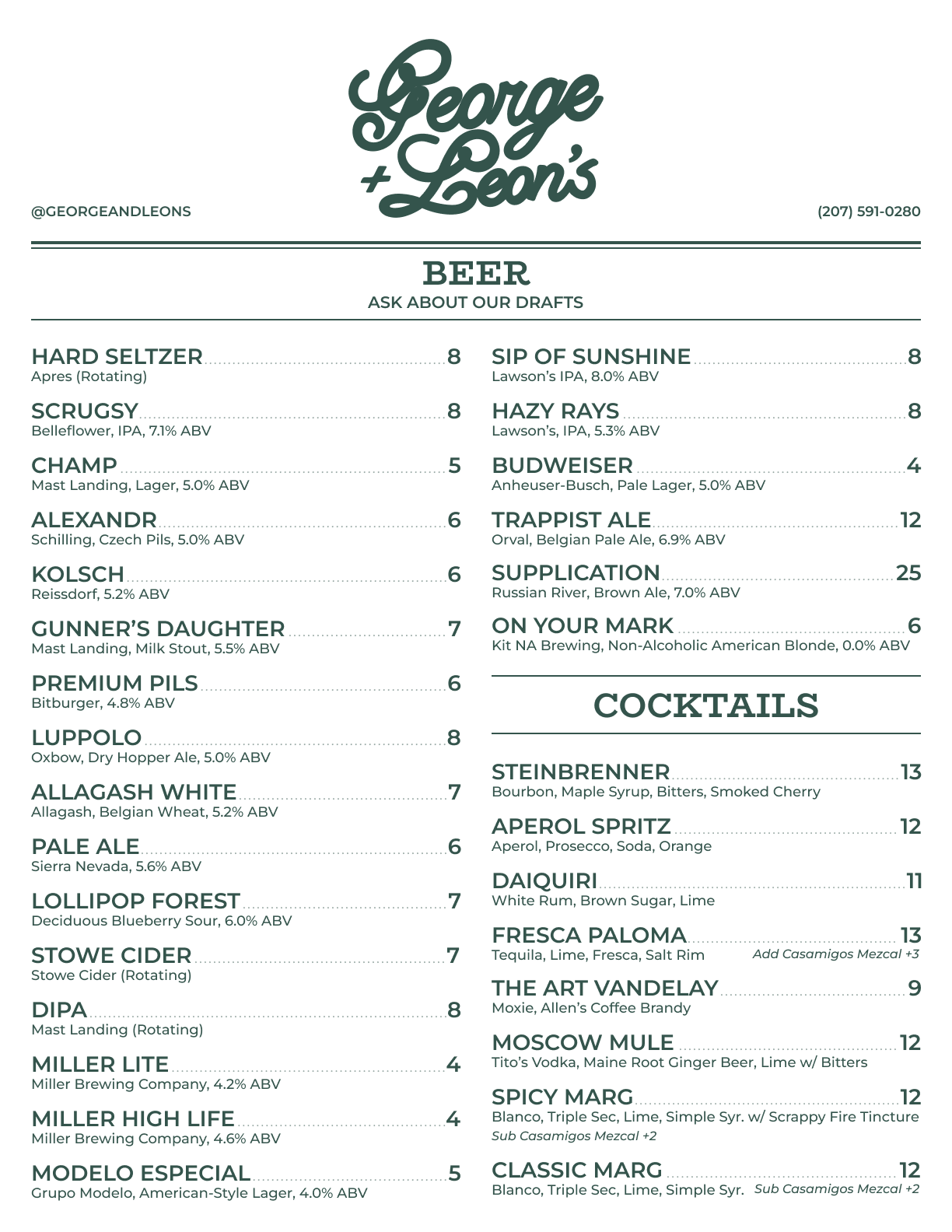
The old menu was hard to read, poorly designed, and didn’t even include all of George & Leon’s offerings. Without hierarchy or clear structure, guests struggled to navigate and the brand came across as less polished than it deserved.

Process
I studied how the menu was being used in the restaurant, identified gaps, and mapped out a more intuitive flow. From there, I explored typography options that could introduce hierarchy without feeling out of sync with the restaurant’s character.
Solution
The final design introduced a traditional menu layout with clear sections, consistent spacing, and new typography that guides the eye. The refreshed structure ensured every item was included, while design choices balanced clarity with personality.

Outcome
The new menus feel both functional and polished. Guests can quickly find what they’re looking for, while the improved design elevates George & Leon’s overall brand experience—matching the quality of the food with a menu that’s clear, engaging, and on-brand.